Contrast is when you use two or more different elements, like colors or fonts, to make something stand out. It’s a great way to make your website or project look more interesting and visually appealing. So, try incorporating some contrast into your designs and see how it makes a big difference!
Why is contrast so crucial in web design?
By setting off some items from one another, contrast in design primarily serves to emphasise the unique qualities of particular objects. Contrasts are frequently pleasant and instantly recognisable to the human eye, making it an excellent tool for reaching new clients and growing your brand.
As designers, we have the obligation to ensure that everyone, including people with visual impairments, can utilise and appreciate the websites we produce. Contrast is quite important in this. We can help people with low vision browse and interact with our websites by utilising contrasting colours, typefaces, and other design features. However, contrast is also a great design technique that can bring depth, intrigue, and personality to our work. So, as designers, let us embrace contrast and explore its various applications. Let’s play around with different sorts of contrast to come up with designs that are not only attractive but also accessible by everyone.
Different types of contrast in UI design
A well-contrasting UI design may increase audience engagement and improve a product’s overall reputation. It’s no surprise that many different sorts of contrast are employed in design to assist make the user experience more fluid and intuitive. Ready to up your design game? Check out the list of contrast types below and discover new ways to make your designs stand out.
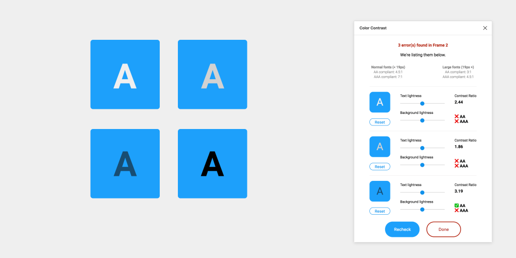
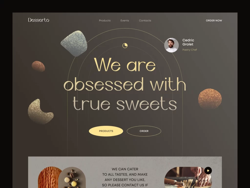
- Color Contrast
Designers frequently use color contrast to add visual interest and draw attention to certain elements. By experimenting with different color combinations, hues, and temperatures, designers can create designs that are both visually appealing and easy to read. Color contrast can also add depth and variety to your designs, making them more engaging and exciting. So, don’t be afraid to play around with different color options and see what works best for your project!
- Size Contrast
Size contrast enables designers to successfully express their message by establishing hierarchy, structure, and visual balance. For example, you may focus the viewer’s attention to the most crucial aspects first and make them the design’s main point by making them bigger.
- Space Contrast
In order to capture attention and convey thoughts of hierarchy or significance in the design, it can also be helpful to create contrast in space by positioning pieces far apart from one another. Negative space, often known as whitespace, is the term used to describe this void surrounding the online content. It is essential for establishing visual balance, order, and a positive user experience.
- Element Contrast
In design, components serve as the fundamental building blocks for constructing visual compositions and expressing various ideas. Designers have a wide range of tools at their disposal, including forms, lines, colours, texture, value, and typography, to create effective and powerful works of art.
- Texture Contrast
In order to elicit feelings and portray the tone of a website, texture contrast, which is the difference between two or more textures within a design, is employed. For example, although rough and contemporary textures convey a sense of refinement and elegance, smooth and organic textures may evoke feelings of cosiness and warmth.
To sum it up, contrast is like the superhero of design – it saves the day by making designs more engaging, effective, and accessible to all. Whether you’re using color contrast, tonal contrast, or size contrast, the key is to find the right balance and create designs that pack a punch. So, if you want your designs to be a knockout, make sure to enlist the help of contrast!