We are all aware of “what is design and its importance,” as well as the difference between UI and UX, which we know well.
But what makes a UI design effective?
I am giving a general example of documentation. As a BA, whenever I create a document and complete it before sending it to my stakeholders or clients, I always take a look at the formatting and look and feel of the document.
What template have I chosen?
What design and format have I chosen?
What fonts and font sizes have I actually chosen to make my document presentable?
Similarly, if I talk about UI design, then various components are required for making it effective.
This effective communication and user experience design by choosing the right fonts and font sizes is known as “Typography.” The typographic hierarchy can greatly enhance the readability and visual appeal of your designs. In this blog, I will explore key considerations and best practices’ for selecting and implementing appropriate typography.
What is Typography?
It is a method and the art of organizing type for making written language attractive, readable, and legible while showcasing.
The systematization of type includes choosing point sizes, typefaces, line-spacing, line lengths, letter spacing, and modifying of the space between couples of letters.
The term ‘Typography’ is also applicable to the organization, style, and appearance of the symbols, numbers, and letters produced by the procedure.
Understand the Purpose:
Before diving into font selection, it’s essential to understand the purpose and context of your design. Different fonts evoke different emotions and convey various messages. Consider the tone, target audience, and overall brand image you want to portray.
Readability is Key:
One of the primary goals of typography is to ensure readability. Select fonts that are legible and easy on the eyes. Avoid using decorative or overly stylized fonts for large blocks of text. opt for clean and well-designed typefaces that offer good character distinction.
Establish Hierarchy:
Typography hierarchy guides readers through your content. By varying font sizes, weights, and styles, you can create visual contrast and emphasize important elements. We can use larger font sizes for headings, subheadings, and important callouts, while keeping body text legible and consistent.
Pairing Fonts:
Combining fonts is an art form. Pairing complementary typefaces can add visual interest and create a harmonious design. Choose fonts that contrast each other in terms of style and characteristics while maintaining a sense of cohesiveness.
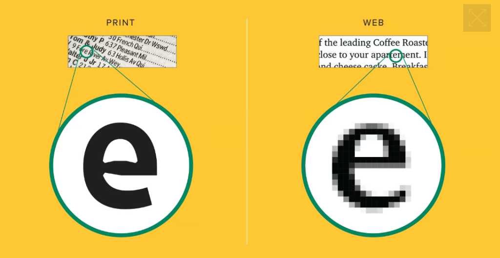
Consider Readability Across Devices:
In today’s multi-device world, it’s crucial to ensure your typography remains readable and visually appealing across various screen sizes. Test your chosen fonts on different devices and consider responsive design principles to guarantee optimal readability and legibility.
Limit Font Choices:
While it’s tempting to use a variety of fonts, it’s generally best to limit your selection to a few well-chosen typefaces. Using too many fonts can create visual chaos and distract from the content. Stick to a cohesive font system that aligns with your design objectives.
Pay Attention to Spacing:
Besides font selection, proper spacing is essential for readability. Adjust line height (leading), letter spacing (tracking), and word spacing (kerning) to create a comfortable reading experience. Avoid cramped or overly loose spacing that can hinder readability.
Accessibility Considerations:
Make your typography accessible to all users. Ensure sufficient contrast between text and background colors, allowing those with visual impairments to read the content easily. Follow accessibility guidelines for font sizes, especially for smaller text or fine print.
Conclusion:
Typography is a powerful design tool that can greatly impact the effectiveness and aesthetics of your visual communication. By carefully selecting fonts, establishing a typographic hierarchy, and prioritizing readability, you can create designs that not only convey information effectively but also engage and delight your audience.