Tableau and Power BI is the most extensively used visualization tools in today’s big data market. People thrive to learn these new skills and also spend plenty of time knowing the usage of these tools. Power BI and Tableau are easy to understand, but when it comes to dashboarding or storytelling by giving useful insights for the organization or society, it is hard to become a pro in this. Therefore, this post will be a quick walk-through for beginners who are struggling in generating meaningful visualization out of raw data.
Understanding Raw Data
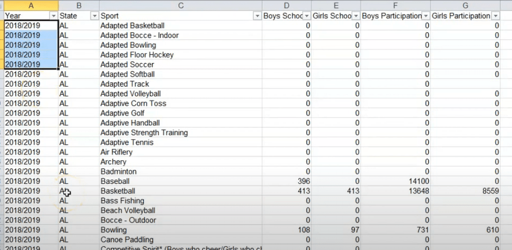
I have extracted this data from the internet and this data basically belongs to US sports in schools. On the basis of provinces of the United States of America, it represents the number of participation of boys and girls in different schools by years.
Basic Data Transformation
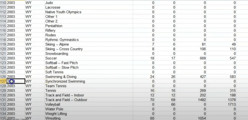
Now we can see here the year column is basically not appropriate so we have to convert it into a particular year format so for that used here the “Right” function in excel where I have pulled out the last four values of the that column. Now below here is the perfect year from 2003 to 2019.
Also, there were some of the null values that have been eliminated by replacing them with zero.
Visualization using PowerBI
Starting with the Power BI here, I have created two sheets the first sheet represents the most popular sports that are in the United States. For that one has to focus on the total number of participants. So, I have created another variable in Power BI basically by adding the number of boys participation and girl’s participation.
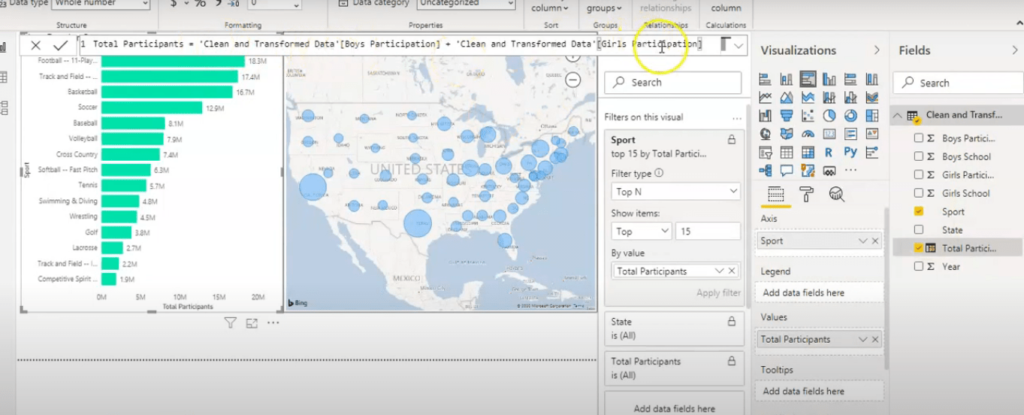
So here we can see the number of participation in football is the highest, along with created a filter that displays top 15 values only.
Now coming to the second chart this is a basic map chart that showing the number of participants’ total hours of participation on the basis of states in the United States.
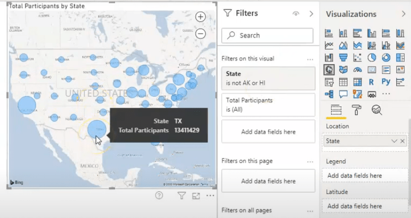
Also here I have put a filter on the state where I have eliminated two of these that are in the US. Using the tooltip and the bubble, it is easily visible that the highest bubbles are for Texas and California and because they have the maximum number of participants from 2003 to 2019. Hence, by these Power BI charts, it is clearly understood that how participation is segregated on the basis of sports and different provinces.
Data Visualization in Tableau
Now coming to the tableau part here we have used the business requirement – On the basis of gender now how the both gender boys and girls are performing. For that, I used a gap between the number of participations between boys and girls by creating a Calculated field. Anyway the number we can see in the chart below that the gap is basically decreasing. From gap I mean to say that the average difference between the number of participation of boys and girls.
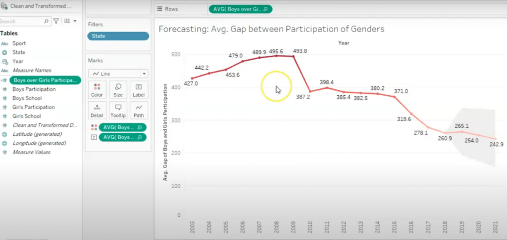
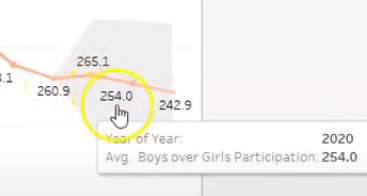
So girls are increasing in these sports so that we can see here the graph is decreasing eventually with years. We have also used the forecasting technique here just to check in the future what will be the trend. Now the trend is also decreasing here which is a very good sign for future sports in US that both genders is performing equally.
The second dashboard is more focusing on similar analysis by some provinces and sports.
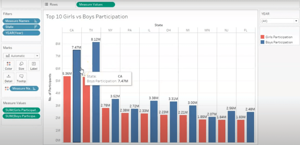
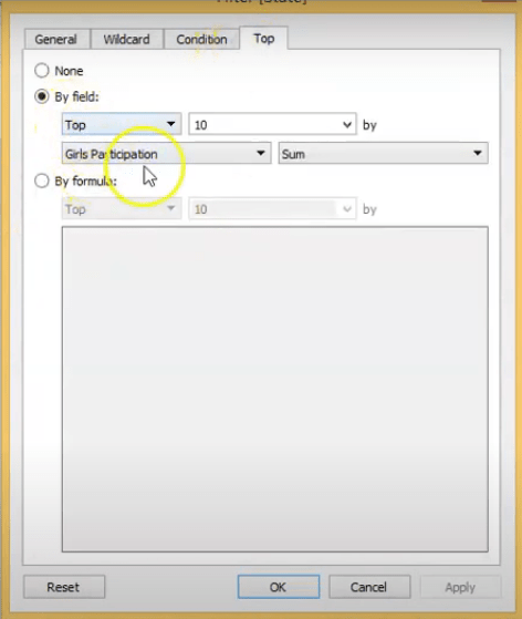
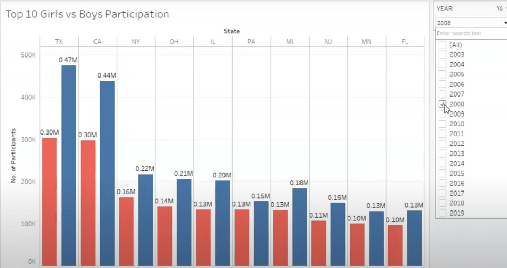
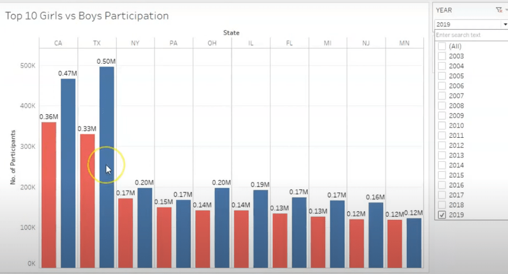
Finding out the top 10 states that are performing well on the basis of girls’ participation.
Also, the comparison is there with the boys participation in these sports. Hence using the filter, select any year from here and find out by what year which province performed best and can be incentivized by government.
We can get an idea that how girls are not performing in equal numbers as the boys are performing. If we can see on the basis of different years so in 2008 this is the scenario and there is a huge gap between the Texas boys and girls, but in 2019 we can see that the gap has been decreased and the California has more number of girls participation than Texas so the trend is improving and we can see a very good number of girls participation
in these sports.
I hope this article regarding Tableau and Power BI – How to convert raw data into Meaningful Visualization will be a toehold for beginners. One can start working on story telling by finding the usage of data as it is depicted in the above example.