
Data analysis and BI tools go hand in hand. Likewise, our project had data as an outcome but we needed a tool to represent that data to you, which was Power BI.
Power BI is a visualization tool, which loads, transforms, and visualizes data. In this project, we have used Power BI for loading data from Snowflake and then visualizing it.
Follow the steps for visualizing your data in an amazing way.
Download Power BI Desktop on your system
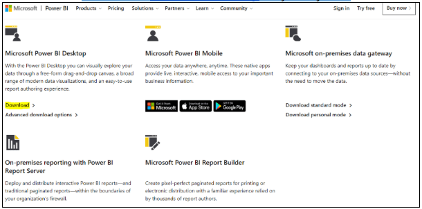
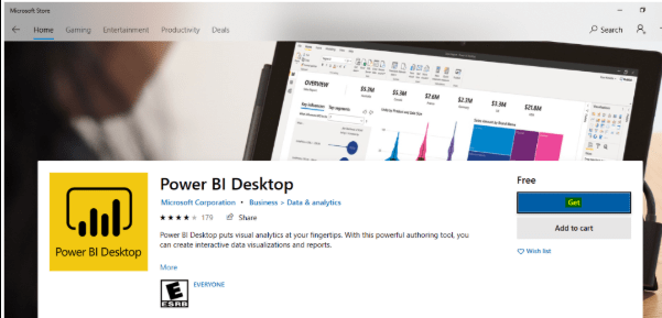
Different Downloads are available according to different usage, but for our use, we only need to load and visualize, So Power BI Desktop is the best option available. Microsoft Store will open with Power BI Desktop download page, or you can also search for the same on Store.
Click on get
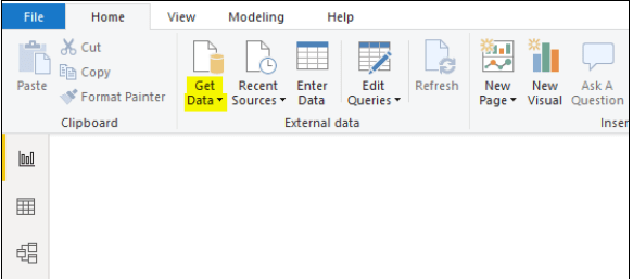
Open your Power BI Desktop
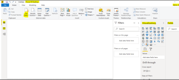
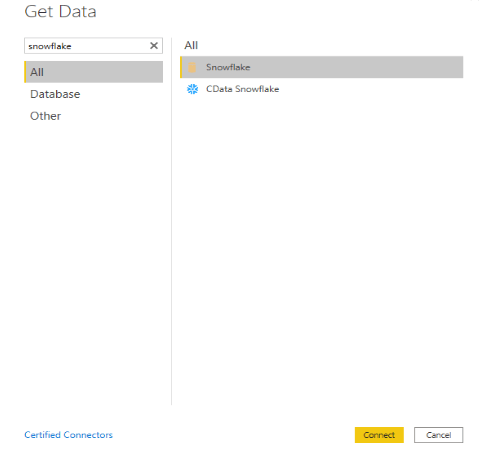
Goto Get Data and click on more
Search for Snowflake and enter connect
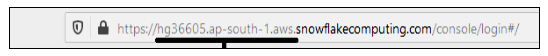
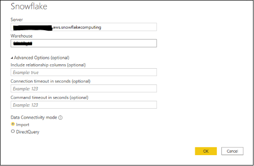
Enter your Server which is an account in Snowflake ( derived from URL, without https:// ).
We will use the import option as default for data connectivity.
Enter the details of Snowflake
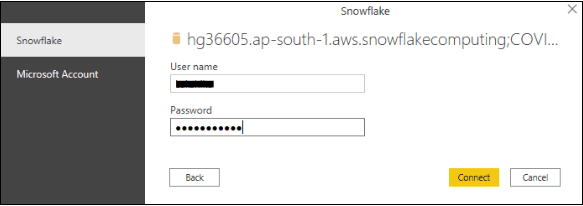
Enter your Snowflake username and password. Click Connect.
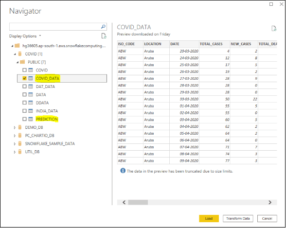
A screen will pop from where you can choose the table you want to load.
Select the table and transform data
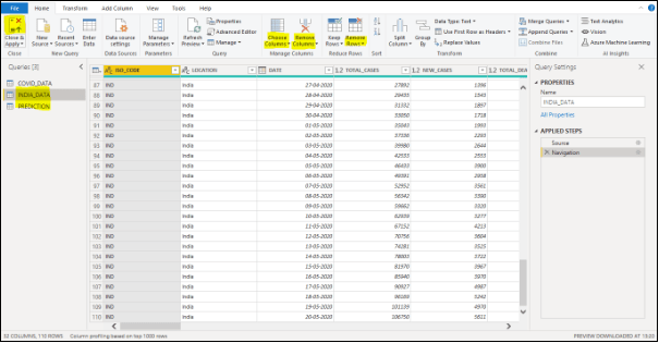
This will open the Power Query, as we have correct data we do not need to transform it.
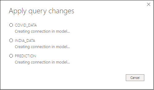
Click to the icon on the upper left corner
It will upload changes to the Power BI Desktop
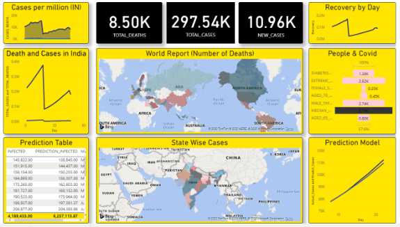
Explanation of how I used all the graphs and data to visualize them.
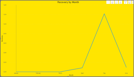
I have used the Ribbon Chart for representing the recovered people by date using RECEVERED_DATA Table.
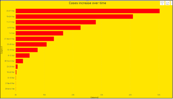
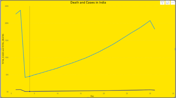
Line Chart represents total deaths and cases over time from INDIA_DATA Table.
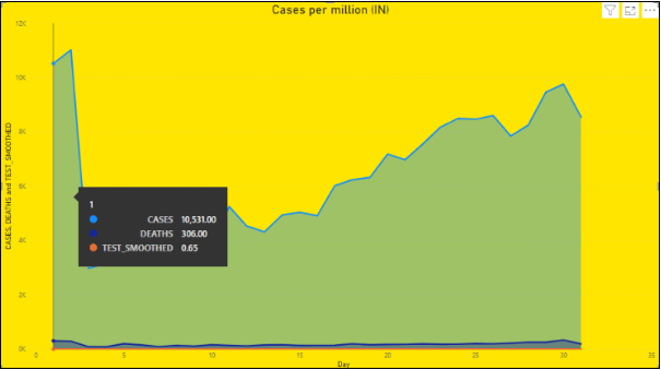
The area Chart shows the number of total cases, and total death per million over time using table INDIA_DATA.
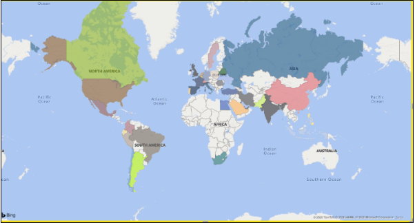
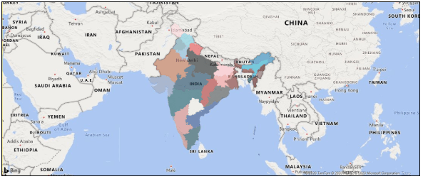
The filled map shows the number of deaths and confirmed cases at different locations of the world using World Data Table.
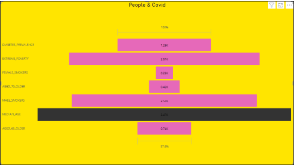
The funnel chart represents the number of people suffering from COVID with problems of diabetes, smokers, aged over 65, 75, and the median age using the INDIA_DATA Table.
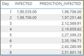
This table shows the number of people infected for the current month using the Prediction Model.
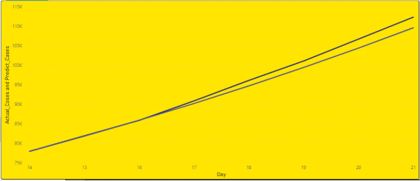
The line graph is showing a comparison between our prediction model’s Predicated Data and Real-time data.
This Map shows the statewide data for deaths and total cases.
Data has been taken from INDIA_DATA Table using the filter for the first row.
This is what your Power Bi Desktop should look like.
Save the file and then upload it to Power Bi Desktop Server to share with others easily.
Here is the Github Repository Link where you can find all the data.