
Geography – I was not so good at it in school. Even I am not so good at it now. But I am a guy who loves python and recently I have got a chance to work in geographical data. Not to mention it have concepts of the polygon, point, arc, and multi-polygon – which I believe I understand. I am going to share my knowledge and experience of a python package named Kepler which may help you plot beautiful images and even deploy them and render them on the go.
There was a space telescope named Kepler build by NASA which helped in exploring structure and diversity of planetary systems.

Point is a point on the face of the earth. literally. Ahh!!. Too much blabber. In the current context of geospatial data, point refers to the GPS coordinates. For example, I live in Bhubaneswar and the GPS coordinates are 20.2961° N, 85.8245° E. In latitude and longitude format it will be 20.296059, 85.824539. Now you might think how can an area be represented by a point? Ain’t points supposed to be a point like literal point which we know from school? The answer is YES. It should be and it is. If you search for 20.296059, 85.824539 on google maps you will reach here, which is considered to be the center of the city where I live. Who am I to say center if it’s not a circle! That brings us to polygons and multi polygons.
No Bhubaneswar this time. Let’s go to Bikaner. Bikaner is a polygon that can be represented as POLYGON ((73.78488104005882 29.04107563104726, 73.7864490432209 29.03979225124357, ……… 73.78436650033153 29.05053821895355, 73.78488104005882 29.04107563104726)). It’s a long list of latitudes and longitudes. Each lat-lon pair is a point and the polygon is the area that appears by connecting all points. On the other hand, if we consider Nicobar from Andaman & Nicobar Island it’s a combination of lands. Multiple polygons combined make a Muti-Polygon. Uff, that was not hard to understand. And of course, the arc is a curved line that connects two points.
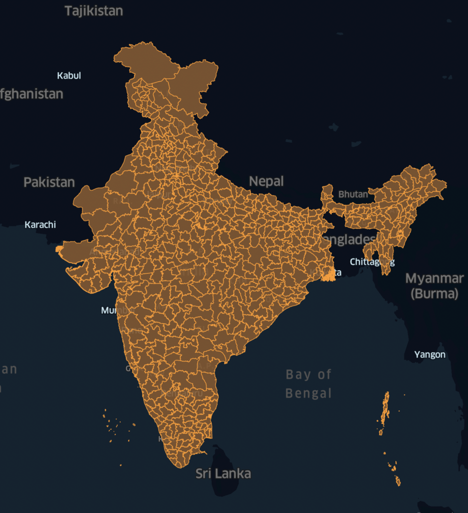
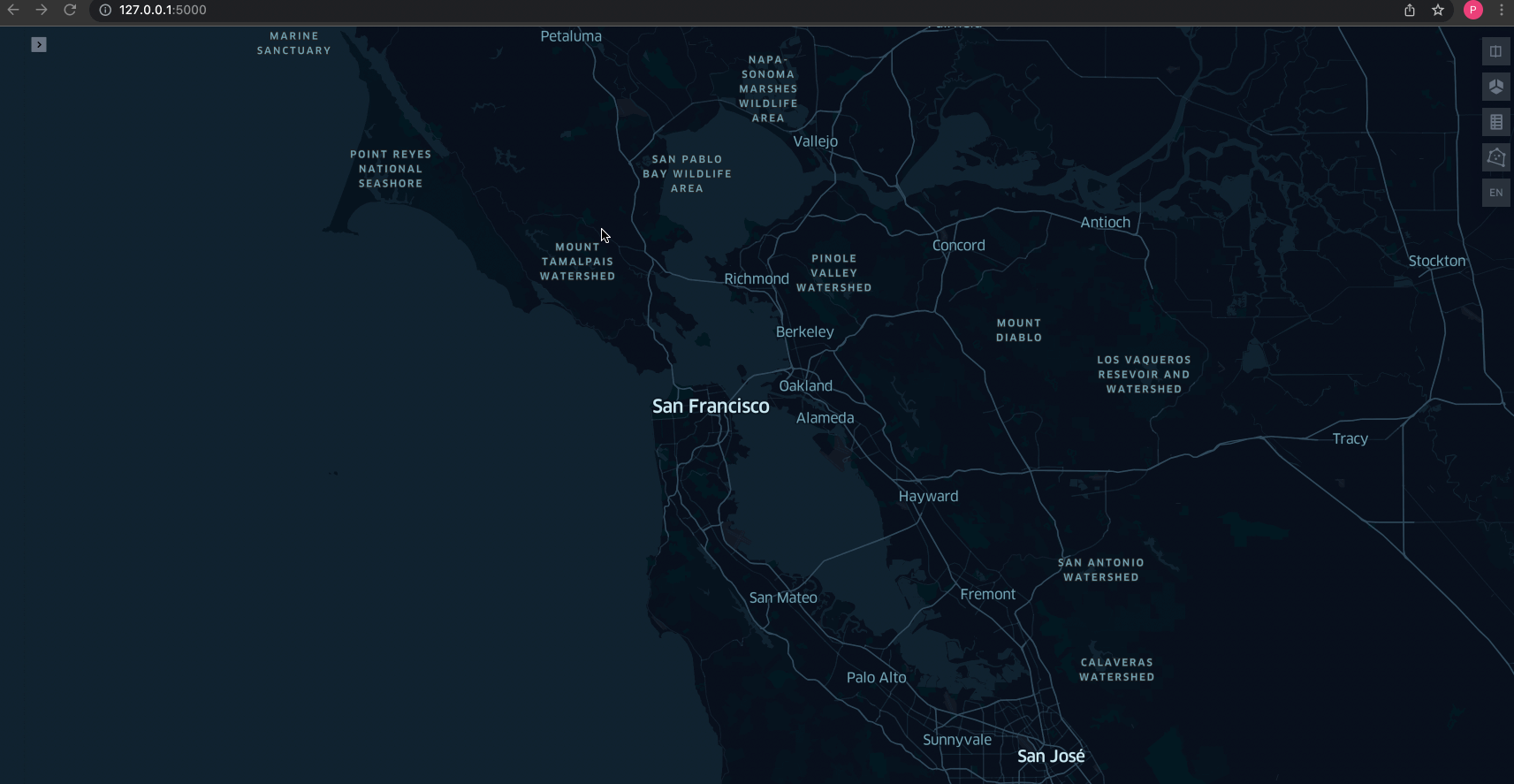
Now you may think, what’s the point! You can see thousands of images on google like this. But can you build a webpage like below? Of course yes! – if you follow through the blog.
So let’s go ahead. Let me share my experience with you of how I build it. Wait, Before that 1 more fact.
Johannes Kepler was a German astronomer, mathematician, astrologer, natural philosopher and writer on music.

- install packages/libraries
- download and pre-process data
- simple flask API to deploy
!pip install keplergl geopandas
Download the district data from https://geodata.lib.utexas.edu/catalog/stanford-sh819zz8121 and save the data from https://www.census2011.co.in/district.php. I have changed the data a bit to avoid a mismatch of names. For example Odisha – Orissa, Jammu & Kashmir to Jammu and Kashmir.
#python
import re
from flask import Flask
import pandas as pd
import json
from keplergl import KeplerGl
import geopandas as gpd
app = Flask(__name__)
@app.route('/')
def index():
fp = "maps-master/Districts/Census_2011/2011_Dist.shp"
data = gpd.read_file(fp)
data.drop(columns=['DT_CEN_CD','DT_CEN_CD','censuscode','ST_CEN_CD'],inplace=True)
data.rename(columns={'DISTRICT':'District','ST_NM':'State'},inplace=True)
census_2011 = pd.read_csv('census_2011.csv')
census_2011.drop(columns=['#"'],inplace=True)
temp = data.merge(census_2011,on=['District','State']).copy()
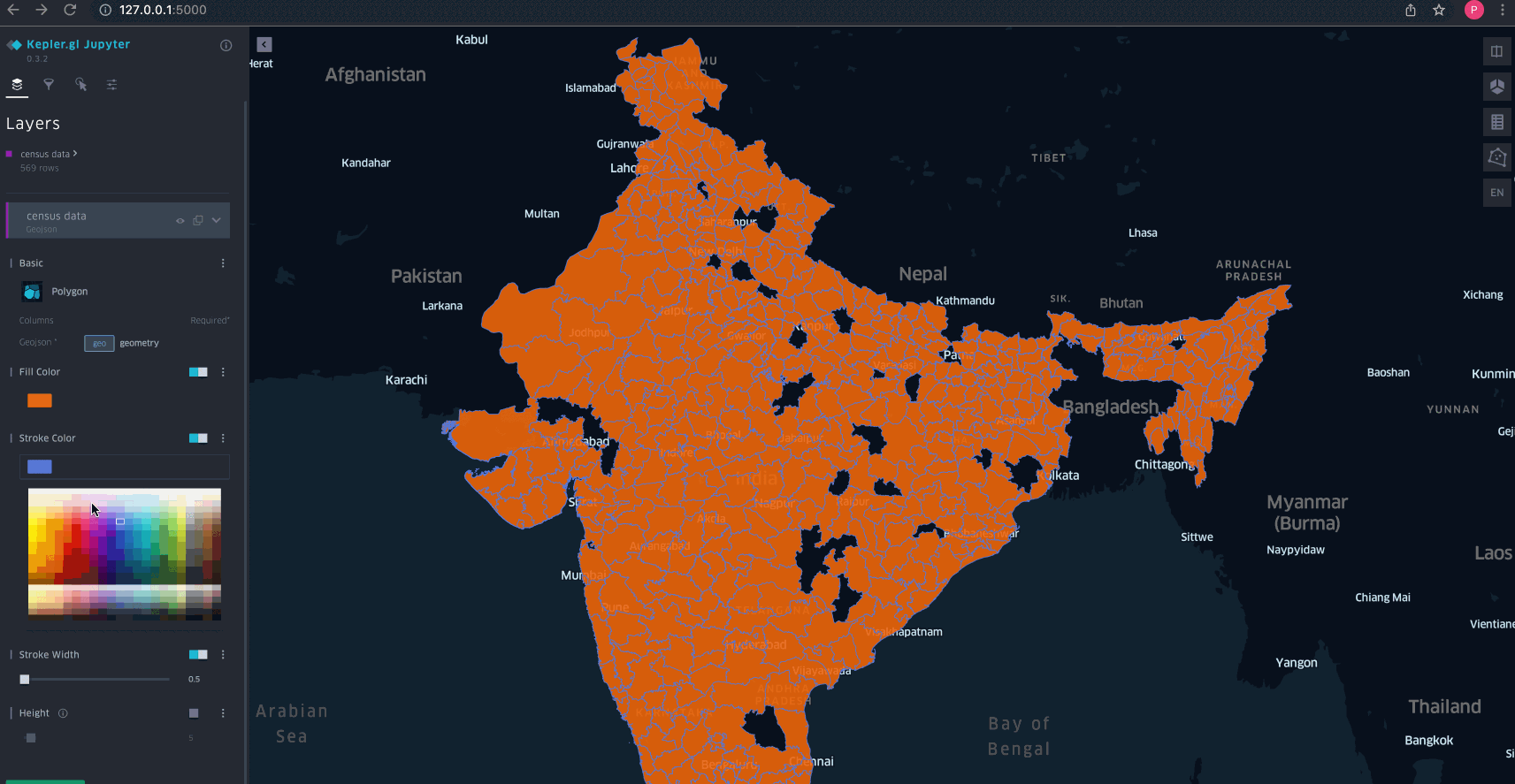
map_1 = KeplerGl()
map_1.add_data(temp,name='census data')
return map_1._repr_html_(read_only=True)
if __name__ == '__main__':
app.run(debug=True)Check the above code or refer to the code in gist and run it using the command python census.py and you will see the webpage at http://127.0.0.1:5000/
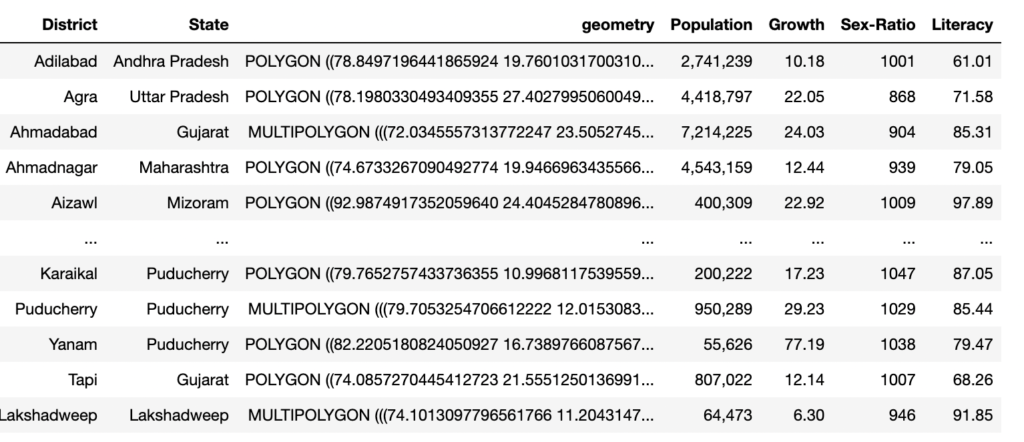
Frankly speaking, we did not do much. The Kepler package did the heavy lifting for us. But it’s important to understand the details. So let’s deep dive. The 2011_Dist. file contains data in the below format.
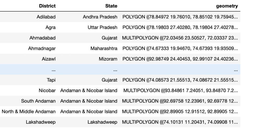
As we can see this data contains geometry shapes which are forms of shapely(a python package for shapes) objects.
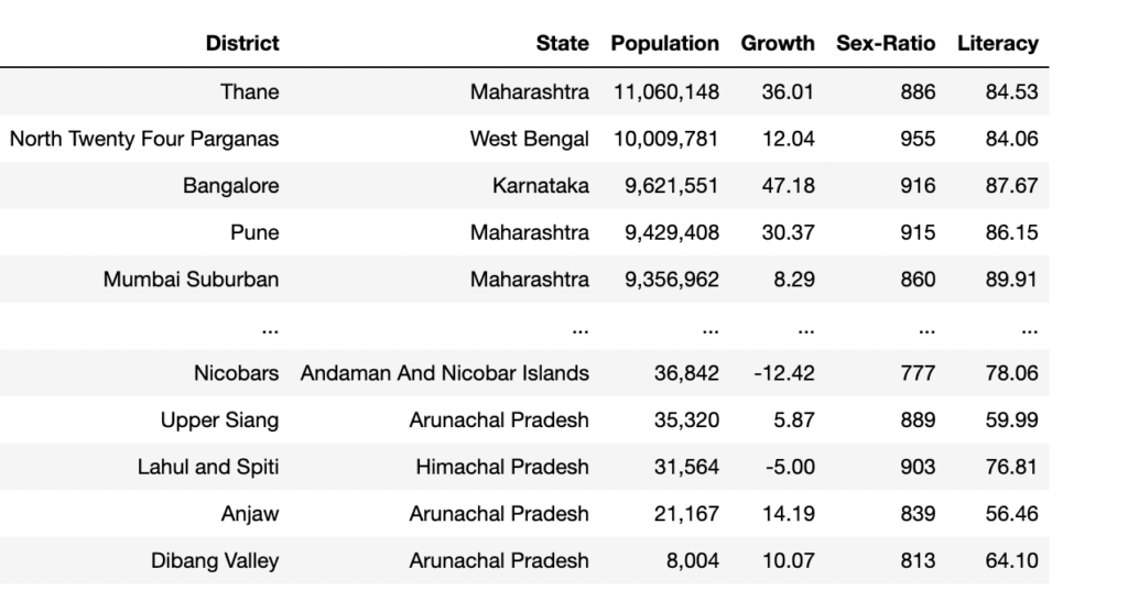
Secondly, the census_2011.csv file contains data in the below format.
After merging we arrived at the final data as below format
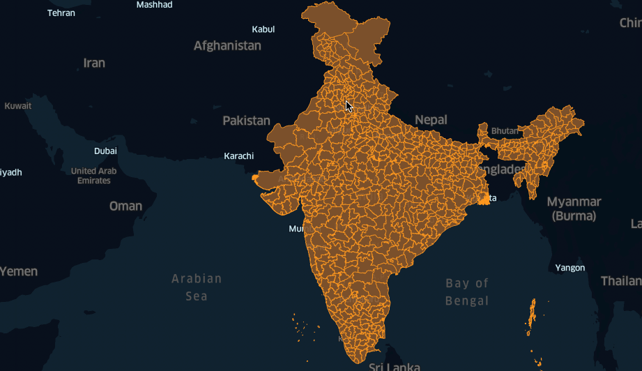
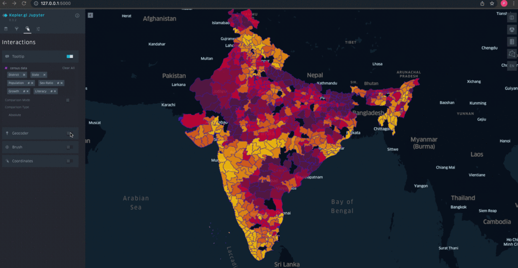
Once we have the data ready, after we host them in a flask, we can play with it. I have given a sample demo below.
- Change subject color
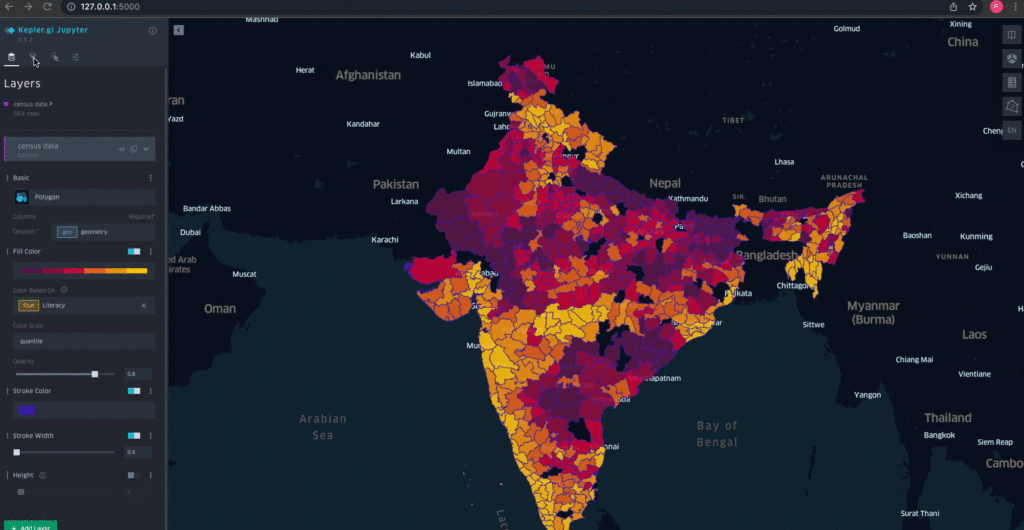
- Change border color and plot polygon heat map
- Filter via different values
- Configure which values pop up(tooltip)
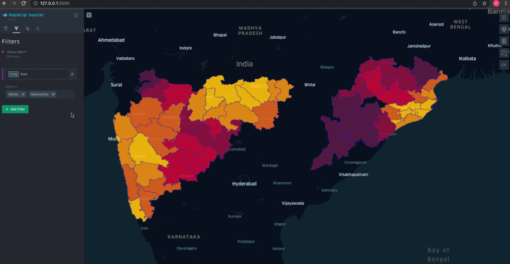
- Enable search and view geo coordinates on the popup.
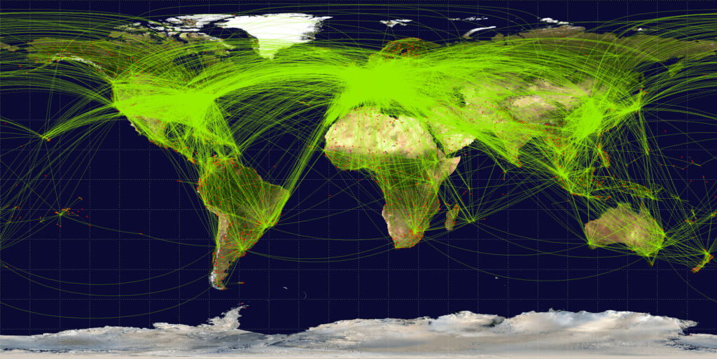
On the end note- Keplergl is a very useful package to deploy visualization systems for users. It has some more capabilities to store the configuration and later use it on real-time data having the same schema. It has options to produce HTML files and build prototype models easily. I am planning to work on Air traffic data – I hope I will find some open-source data where my goal is to build something similar to the below image. If anyone comes across such a dataset or works collaboratively feel free to reach me at [email protected].
Happy Learning.
References-
- Census data: https://www.census2011.co.in/district.ph
- Geo data: https://geodata.lib.utexas.edu/catalog/stanford-sh819zz8121
- Kepler.gl API Documentation: https://docs.kepler.gl/docs/api-reference
- Kepler.gl Jupyter Notebook Documentation: https://docs.kepler.gl/docs/keplergl-jupyter


