Designing User Interface for the Future – 1
The technological growth in the form of invasive AI and now Metaverse have opened up flood gates of opportunities and challenges for the UX designers. Can we still use the traditional Design Thinking Process for any of the design challenges future is about to throw at us?
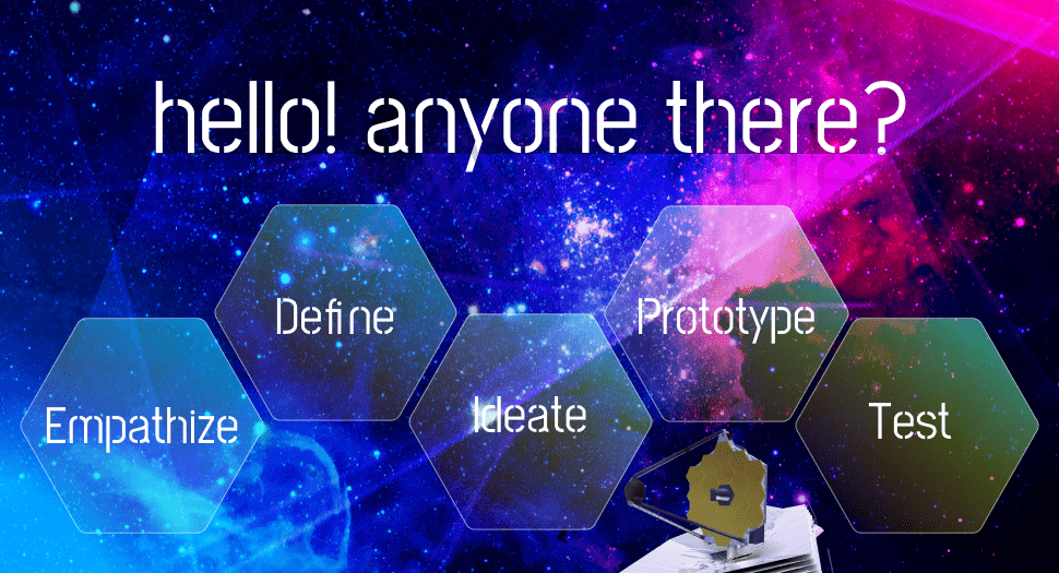
Let’s suspend our disbelief and imagine for a moment. There is a global crisis situation, similar to the ones we have often seen in Hollywood movies. That the James Webb Telescope has found an exoplanet with thriving bio-markers in our good old Milky way. We have conclusive proof of a hyper-intelligent alien civilization as the IIS have picked up some form of radio communication from those beings. Congratulation earthlings, we have neighbors!
The globe we live on is about to burst in crazed excitement and the wiser and responsible ones among us are panicking. We need to communicate right and we must project our best image to the aliens. We can’t have a Star Wars or Mars attack scene. The scientists and experts are super busy deciphering the communication. The hush-hush whispers say they have cracked the code and it says – ‘What/Who are you’! Now the Earth must respond. We are past the radio signaling stage. Sending a one-liner saying ‘We are humans from the planet Earth and we have come in peace’ will not suffice. We must take advantage of the technological leap and come up with a more definitive and generous mode of the intergalactic communication channel.
NASA is gathering an army of IT professionals from across the continents, best among the best in their fields to develop a communication channel that can be beamed from the earth in the form of a holographic interface for the aliens to interact with and learn about our world. They aren’t planning to build a game or treasure hunt for our alien friends. The primary intent is to interest/intrigue them enough to be responsive and reciprocal by interacting with the holographic interface or the content within. In the future, our scientists/experts would eventually find better and more effective two-way communication channels. Rumour is that they are also scouting for a team of UX professionals who would design that interface.
Question to my UX fraternity, would you like to be part of that team? I know I would. So, if ever you get a call, and after recovering from seer shock and exhilaration, what are the first things you would do? What tools would you pack in your proverbial toolbox? Where would you begin? How do you apply the regular UX Design thinking process for this extraordinary situation? We know next to nothing about our target users. How would you begin your user research? Do they see, hear or feel in the same manner as we do? Forget about behavioral patterns or empathy maps we do not even know that they have human or animal-like limbs? But we can always try.

Empathize – Identify the User
We can start by gathering all available information (including the classified ones) about the newfound planet and its residents. We interview the scientists and the experts. We pour into the diagrams or charts representing the interplanetary communique even though the content goes over our heads. Unfortunately, we cannot observe or meet or interact with our users. But this is not a new phenomenon. There are instances when UX designers have to design application interfaces for the users who they would have very little knowledge. What do we know about the aliens –
- That they have built an earth-like civilization.
- That they can procreate and maintain continuity of their species and sustain growth.
- They may have some form of motor or physical abilities.
- That they have cognitive competencies, for being able to construct and sustain their planet.
- They are responsive and have displayed curiosity about the earth. They are social beings.
- The experts say aliens seem to have the sensory ability though we are still not clear if they are similar to our sensory organs.
- That they have the ability to feel and may have human-like emotions.
- That they can apply problem-solving competencies to understand information.
Define – User’s Problem and Needs
Can we create a persona of our user? Probably not. But we can have a representational proto-persona for the entire alien world. Based on the assumptions and knowledge we have gleaned so far, we can walk beside our alien friend who wishes to explore the wonders of the earth via an interactive holographic board. Can we imagine observing them for a moment? Now let’s see the insights we have drawn –
- From the user’s perspective: “We are alien to your world and culture, and we have only a few known commonalities such as curiosity to learn and intelligence to understand and navigate through complex and layered information. However, since we do not share a similar world or life form, we are not sure if we would be able to follow your (human) language or any other audio-visual markers. Though we are curious to know.”
- From a user research perspective: Aliens who are completely different from humans and have zero awareness about the earth may find it difficult to understand human form of communication. ”
- Problem Statement based on the four Ws—who, what, where, and why: “Our new Alien friends belonging to a completely unknown/different species who have zero awareness about us want to know about our beautiful world. Our solution should deliver a multisensory immersive mode of message board for them to learn about us via whatever sensory mechanism they can use.
(Multiple problem statements can be defined depending upon the scenarios, user/s needs, task complexities, and goals. )
Ideate – Fire on all Cylinders
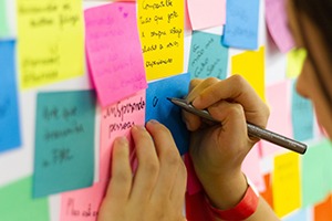
Now the fun part! Let’s gather the entire IT team assigned to the project. We all can jot down or sketch our ideas on sticky notes and paste them on the board and then throw darts at them. But before getting inside the Ideation room, we should drop our designers’ baggage and personal biases or preferences. This is a time to optimize collaborative strength so that individual limitations do not hinder us from learning fast or seeking help from others. Easier said than done. But the sole intent is to design the best possible solution for ‘our alien user’. Every participant would be encouraged to throw in as many ideas as they can think of. Even the ridiculous ones to the seemly brilliant ones. No idea is far-fetched or crazy. Even an absurd idea can be calibrated to meet the user’s needs while the much-touted traditional idea can make the user abandon the product.
“the process of generating a broad set of ideas on a given topic, with no attempt to judge or evaluate them.”
The Nielsen Norman Group
Meanwhile, we also gather more information about the message content to be beamed to the space or at least the form or structure of it from the experts and world leaders. Such as whether it is going to be a simple slide show of photos, video, voice messages, or an interactive tour of the earth in a virtual reality environment, to help us in designing navigational map and presentation style. How much user control should we provide or we should only show off an amazing visual encyclopedia of the earth? Since the proposed solution intends to provide a multisensory experience, an array of tools such as –
- User Journey map – In this case we may have to pretend walking and observing our proto persona.
- Sense Modalities – We can explore possibilities of applying some of the sensory triggers in the design elements (there are 9 sense modalities – hear, see, smell, taste, touch, pain, mechanoreception, temperature, and interoception) to ensure the aliens doesn’t miss out on sensing and registering the message. The tactile user controls can help in triggering user interest and intrigue. We can use body storming method to explore possible physical aspect or usage patterns our users may follow. Are they going to use three fingers, or do they have sensors on their skin or in the brain?
- Analogy – What analogy can we think of that can be compared with the situation our users are in. The closest that comes to my mind is the zoo or a reserve forest where the animals have to stumble upon a tablet or iPad. Or how an octopus or any other underwater sea creature underwater would behave if it comes across an unfamiliar object.
- Brain Storming – Sometimes noisy but very effective tool to generate blended design ideas. We would need this more than ever particularly because proposed ideas would have to rely heavily on assumptions. Mind mapping or mental model in the human sense may not yield much. Yet, we can follow them. Who knows what all we may discover.
Evaluate
Each facet of the UX design requirements is discussed thoroughly, notebooks are filled with sketches and the whiteboard is covered with sticky notes of various colors. We now sit down and evaluate the collections of ideas. Each feature of the solutions would have to be dissected to see how best it addresses the user needs as defined in the problem statement. The notes and ideas representing the best possible solution are recorded to be used as a blueprint for the prototype.
Prototype – Give Life to the Solution
Our solution is now mapped to the user’s needs. We now shape, structure, and stitch our design solution!
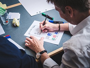
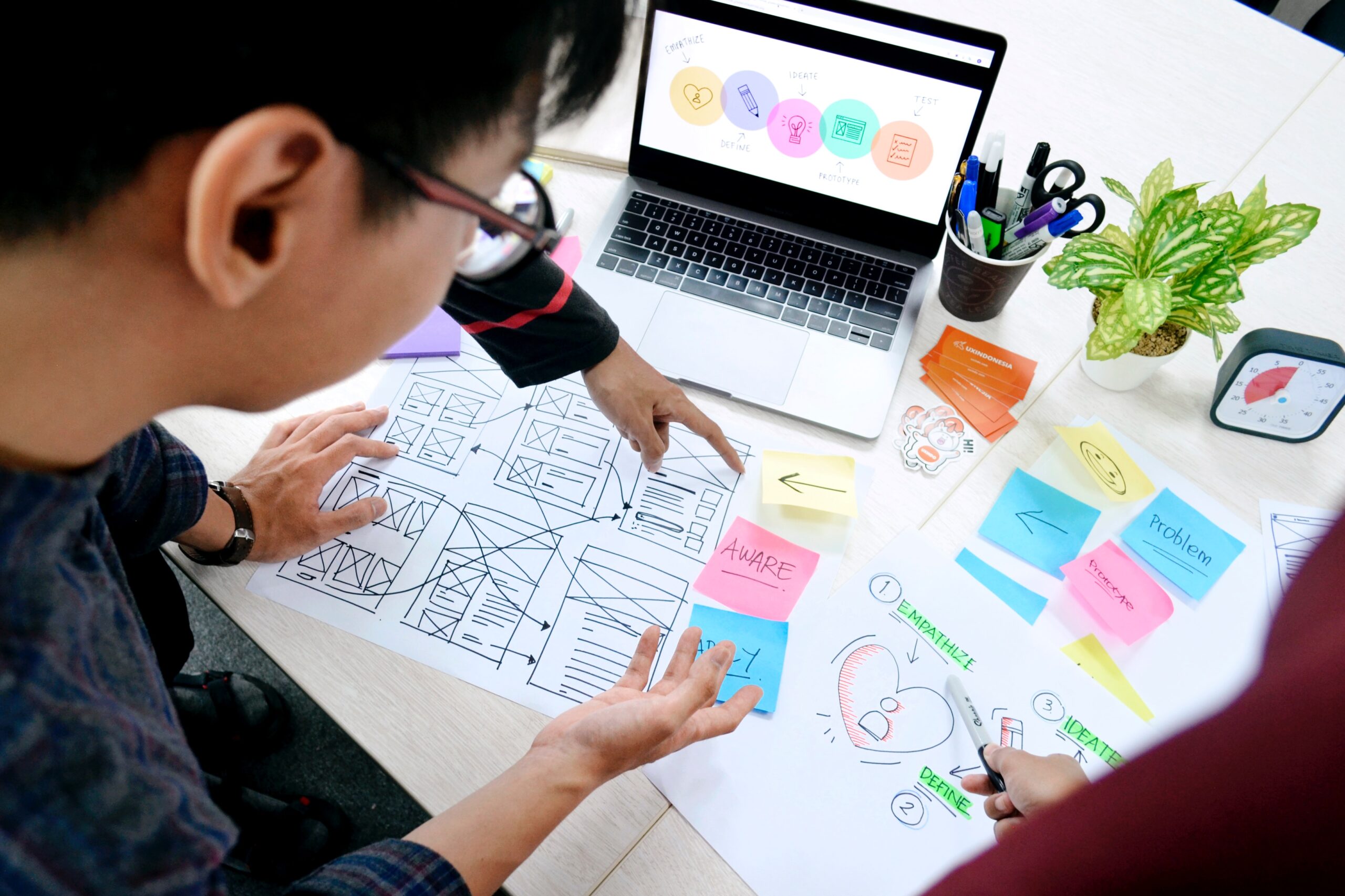
We can start with the wireframe. The paper prototype is the quickest way to find blunders or gaps in the solutions. If a design course correction is needed the designers can go back to the ideation board without feeling big pressure of rework. In fact, the best practice is the designer can start working on paper prototypes while the ideation stage is still ongoing. We can move to the next stage of Test at this point. We can call it the round 1 usability test of the prototype.
However, the paper prototype is in no way close to the real UI. With the help of the paper prototype, we can then move on to spill the digital magic on the design with the help of font and color palettes, interactive design components, animated transitions, touch or gesture-based user control, audio, and visual feedback, screen flow, navigational map, drill in mechanism, animated options for progressive discloser. Essentially first cover the most critical and persistent features in the initial prototype and then move on to include the detail templates, panels, or such reusable components.
Test – Map Solution with the User’s Need
We bring out our talisman – the Problem Statement and see if the designed prototype meets the user’s need. We share the prototype among a select group to try out on their own or have a collective test session by beaming (assuming we have the technology) the holographic design on a wall or into the night sky. We test every button and another screen component to evaluate if the UI is behaving the way it should. Can an alien now use this solution or to view-process and learn more about the beamed message? If the solution doesn’t work or falters in any way in the test, we go back to the prototype or if necessary to the ideation stage to make further iteration and refinements.
Some key points:
- Though everyone knows, I must mention it again – The design process is iterative.
- Design thinking is not necessarily linear. But it is necessary for the designers to follow the first two stages and have a well-defined problem statement before jumping into the ideation stage.
- The process is not meant to imprison creative minds. They merely provide a well-trodden roadmap for the designer to follow and find their way.
- Have a couple of sheets of paper and note down the insights drawn from the design thinking process and your UX strategy.
- Keep your Design strategy pinned on the work desk wall. They are your talisman particularly when designers fall into the trap of self-indulgence or face creative block.
- Tools do not design. However, they can accelerate the designing process and are meant to help the designer to be more efficient.
- Keep acquiring useful new tools in your toolbox. But use the tool that is scalable and accommodative for changing requirements and sifting benchmarks.
- It’s a myth that the designer would need a state of art ideation room full of fancy stationaries to be able to come up with the best design solution. But putting a team in a room will facilitate team synergy and collective thinking for a common goal.
- The best idea can be drawn on a paper napkin. But for the best result, the ideas must be recorded and be available to the stakeholder for review and feedback. Besides collaboration generates diverse ideas.
- The ideation should generate multiple designs. The best solution can be then drawn by evaluating each one against the user’s needs.
- Till a few years back user cantered design stands over four pillars – Navigation, Presentation, Content, and interaction. But with the advent of Siri, Alexa, or such AI-powered assistants, conversation design is added to the structure. And then the next addition would be designing multisensory UX.
References :
The Ultimate Experience: A Guide to the Principles of Sensory Design by Micah Bowers (https://www.toptal.com/designers/ux/sensory-design)
Ideation for Everyday Design Challenges by Aurora Harley (https://www.nngroup.com/articles/ux-ideation/)
Design Thinking (https://www.interaction-design.org/literature/topics/design-thinking)
Add Comment
You must be logged in to post a comment.


