

Unleashing Business Intelligence with Looker: A Journey Through E-Commerce Insights
As businesses increasingly shift toward data-driven strategies, tools like Looker have become essential for translating raw data into actionable insights. Whether you’re in marketing, operations, or customer success, the ability to visualize and interpret data efficiently can drive smarter decisions and better outcomes. In this blog, I’ll walk through a series of hands-on exercises completed using the Looker platform—each focused on analyzing different aspects of e-commerce performance, from acquisition to returns and user growth. These tasks not only showcase Looker’s intuitive UI and robust capabilities but also reflect real-world scenarios where such insights can inform business strategy.
Understanding Customer Acquisition: Orders by Traffic Source
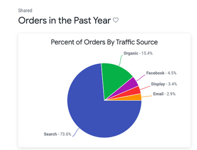
To begin, I explored Looker’s ability to break down customer acquisition data by visualizing the percentage of orders coming from various traffic sources over the past year. Using the Order Items Explore, I filtered the dataset to include only orders placed within the last year and segmented them based on the traffic source dimension. To enhance the analysis, I introduced a custom table calculation that displayed the proportion of each source relative to the total number of orders. The resulting pie chart offered a quick and intuitive view of which channels were driving the most orders—providing marketing teams with actionable insights on where to focus their acquisition efforts. This visualization was then saved to a new dashboard, making it easily accessible for ongoing monitoring and decision-making.
Mapping Regional Trends: Orders by State
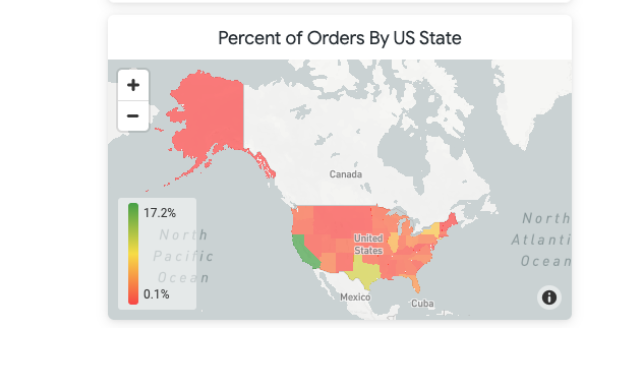
To build on the previous insights, I next visualized the geographic distribution of order activity across the United States. Using Looker’s flexible data exploration tools, I filtered the dataset to include only orders from the past year and focused exclusively on those originating within the USA. By adding the State dimension and applying a table calculation to show each state’s share of the total order volume, I was able to generate a percentage-based breakdown of performance by region. This data was then visualized using Looker’s built-in map chart, which highlighted state-level trends using a color scale to emphasize volume differences. The final visualization was added to the existing “Orders in the Past Year” dashboard, offering a clear and interactive view of regional demand patterns across the country.
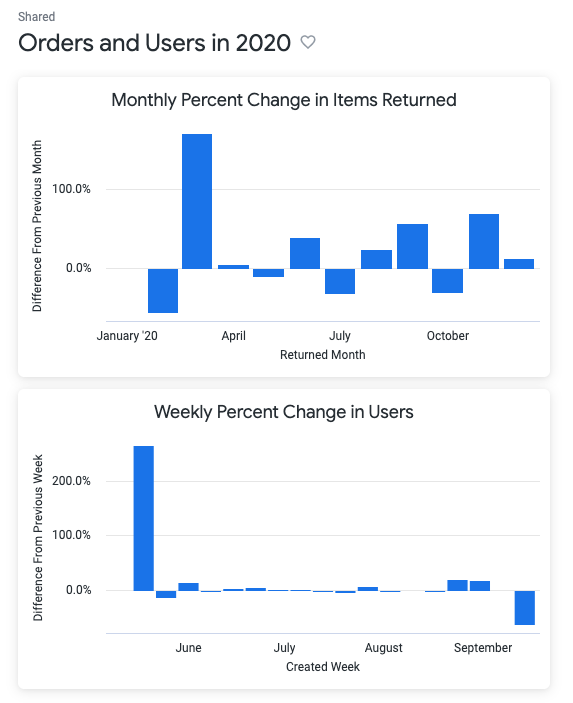
Tracking Return Behavior: Month-over-Month Change in Returned Items
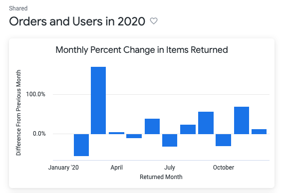
To dive deeper into post-purchase trends, I focused on analyzing the fluctuation in returned items over the course of 2020. Leveraging Looker’s advanced table calculations, I first filtered the dataset to include only returns made during the 2020 calendar year. Then, using the offset() function, I calculated how the number of returned items changed from one month to the next—providing a dynamic view of customer return behavior. A secondary calculation helped convert this difference into a percentage, making the trend easily interpretable. The results were visualized through a column chart that clearly highlighted month-over-month variations. By hiding the base count fields from the visual, the final chart kept the focus on percentage change, offering quick insight into seasonal spikes or unusual return rates. This visualization was then saved to a newly created dashboard titled “Orders and Users in 2020,” offering stakeholders a data-backed view into return patterns and their potential business impact.
Monitoring Growth: Weekly Change in New User Signups
To understand user acquisition trends during a key business period, I created a visualization that tracks week-over-week changes in user signups between May 15 and September 15, 2020. Using the Explore section within Looker, I filtered the user data down to the specified date range and grouped it by week. Leveraging the powerful offset() function, I calculated the number of users created in the previous week and compared it with the current week to determine the percentage change.
Two table calculations—Users Last Week and Diff From Last Week—provided a clear, time-series representation of fluctuations in user signups. The final visualization, built as a column chart, made it easy to spot upward or downward trends. To keep the chart clean and focused, base counts were hidden, leaving only the percent change visible along the Y-axis. Formatting the X-axis to display weekly dates in MM-DD format offered an intuitive chronological flow.
This insight was added to the “Orders and Users in 2020” dashboard, complementing the earlier analysis on item returns. Together, these visualizations present a comprehensive view of customer behavior over time—capturing both purchase reversals and new user engagement.
Conclusion: Visual Analytics that Empower Decision-Making
These exercises demonstrate just how powerful Looker can be in transforming raw e-commerce data into meaningful insights. From tracking acquisition channels and regional trends to analyzing product returns and user signups, Looker provides an accessible yet robust environment for deep data exploration. The dashboards created through these tasks not only serve as tools for visual storytelling but also empower teams across the organization to make informed, strategic decisions. Whether you’re scaling a startup or managing analytics for an enterprise, Looker proves itself to be a game-changer in the world of modern business intelligence.