

Flying into Data: Unlocking Aviation Insights with Looker
Introduction
In today’s data-driven world, the ability to quickly analyze and visualize large datasets is crucial for making informed business decisions. Organizations that can harness the power of data effectively gain a significant edge in optimizing operations and driving strategy. This blog will showcase how Looker Studio, a powerful data visualization tool within Google Cloud Platform (GCP), can be used to turn raw data into actionable insights for business decision-making.
In this demo project, I utilized FAA datasets to help a private plane and helicopter rental company answer several key questions about their operations and strategy. The goal was to create a set of dashboards that would enable the company to identify optimal locations for new rental hubs, assess flight cancellations, and analyze airport traffic patterns.
Throughout this blog, I will walk you through the process of using Looker Studio to address these business questions, highlighting its key capabilities and how it can be used to solve real-world data challenges. Whether you’re a seasoned data analyst or a beginner exploring GCP tools, you’ll see how Looker Studio can transform raw data into clear, actionable visuals that drive smarter business decisions.
Identifying Optimal Rental Locations
Most Heliports by State and City
To begin, I focused on creating a visualization to identify which states and cities have the most airports with heliports. Using the Airports dataset, I built a table visualization that displayed three key columns: City, State, and Airport Count. This allowed me to pinpoint the cities and states with the highest concentrations of heliports. To ensure clarity, I limited the results to show only the top states, and sorted the Airport Count column in descending order, placing the areas with the most heliports at the top. Additionally, I applied a filter for the Facility Type to make sure only heliports were considered in the analysis.
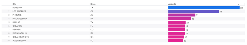
Figure 1: Most Heliports by State and City
This Look, titled “Top Count Cities With Most Heliports,” provides valuable insights that can guide the company in selecting the best locations for expanding rental hubs based on demand in key areas.
Facility Type Breakdown for Top States
Next, I created a visualization to analyze the facility type breakdown for the states with the most airports. By leveraging the Airports dataset, I built a table that displayed the Airport Count, State, and Facility Types. The results were limited to the top states, and I used a Pivot to categorize the data by Facility Type, with the facility types sorted in descending order. This approach allowed me to clearly see how different types of airports (such as public, private, or heliports) were distributed across the states with the highest airport numbers.
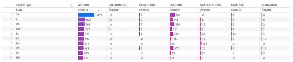
Figure 2: Facility Type Breakdown for Top States
The resulting Look, titled “Facility Type Breakdown for Top Count States,” provided important insights into the airport landscape in these key regions, helping the company understand the diversity of facilities in the areas where new rental hubs could be set up.
Analyzing Flight Cancellations and Performance
High Cancellation Rates at Major Airports
For the next visualization, the focus shifted to understanding the airports and states experiencing the highest flight cancellations, particularly for those handling over 10,000 flights. Using the Flights dataset, I created a table that displayed three key columns: Aircraft Origin City, Aircraft Origin State, and the Percentage of Flights Cancelled. By filtering for airports with more than 10,000 flights, I was able to zero in on the busiest airports and analyze their cancellation rates. Sorting the data in descending order, I highlighted the locations with the highest cancellation percentages.
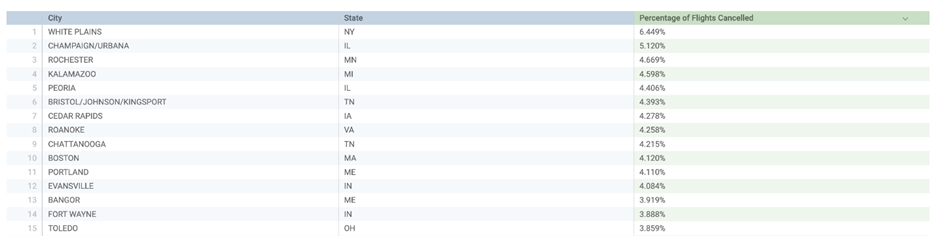
Figure 3 : High Cancellation Rates at Major Airports
This visualization, titled “States and Cities with Highest Percentage of Cancellations: Flights over 10,000,” not only shed light on operational inefficiencies but also provided a clearer picture of where improvements might be needed to enhance reliability and customer satisfaction.
Shortest Average Flight Distances
For the final visualization, I turned my attention to understanding the origin and destination airports with the smallest average distance between them. Using the Flights dataset, I built a table that displayed two columns: Origin and Destination airports, along with the Average Distance (Miles). By applying a filter to include only distances greater than zero, I was able to focus on the relevant flights. The data was sorted in ascending order, highlighting the shortest average distances between airports.
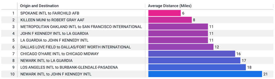
Figure 4: Shortest Average Flight Distances
This Look, titled “Top Count Airports With Smallest Average Distance,” provided valuable insights into flight patterns and regional connectivity, showing where the shortest routes occur and potentially revealing opportunities for optimizing scheduling and fleet management.
Bringing it All Together: The Dashboard
To provide a unified view of insights, all visualizations were brought together into a single, interactive Airlines Dashboard. In addition to the four core Looks, a merged result visualization was added—highlighting the busiest joint-use major airports with control towers. This bar chart, built by merging filtered data from both the Flights and Airports datasets, showcased the top 10 cities with the highest flight volumes at these strategic locations.
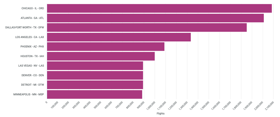
Figure 5 : Merged result
Final Thoughts
Looker Studio stands out as a powerful tool for transforming complex datasets into clear, actionable insights. Through intuitive dashboards and dynamic visualizations, it makes it easy to uncover hidden patterns, monitor key metrics, and drive smarter decisions. This exercise highlighted just how effectively Looker Studio can support strategic goals—whether it’s optimizing flight routes, identifying new rental locations, or evaluating operational performance. For anyone looking to turn raw data into impactful stories, Looker Studio is a valuable companion on the path to data-driven success.