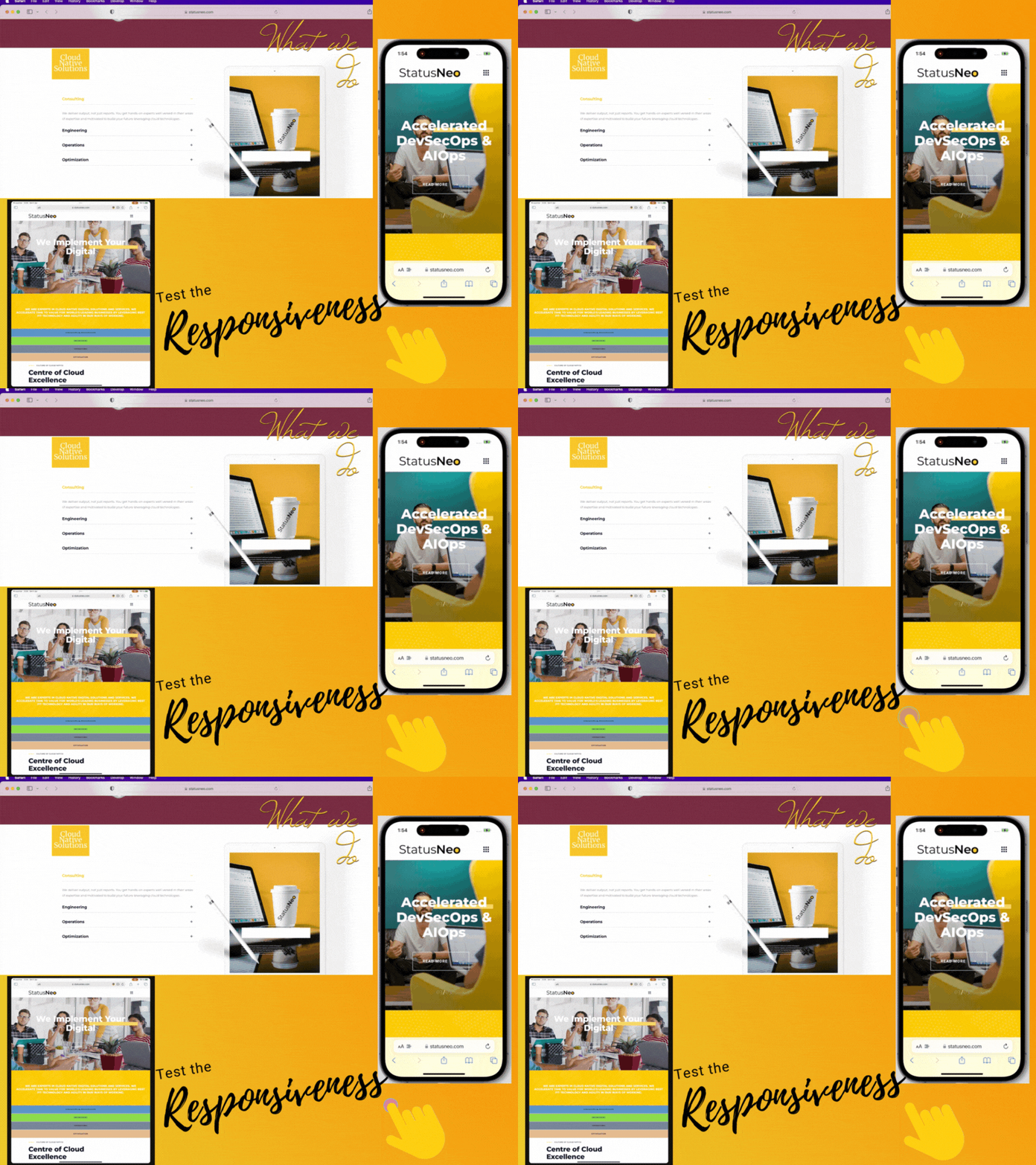
Test The Responsiveness Of The Application Or Website On The Devices
The term “responsive” refers to a website or application that can adjust its layout to fit different screen sizes. Once a responsive website or application has been created, it must be tested to ensure that it functions as expected across all devices. This process of testing is called responsive testing.
Responsive testing is important for two main reasons:
- It ensures that your site or application looks and functions correctly on all devices.
- It ensures that users have a good experience no matter what device they are using.
If your site or application is not responsive, users on devices will experience poor usability. This is because of the reason that small screens commonly result in cluttered text and buttons, making it difficult to access content or make selections.
Things to consider when performing responsive testing:
1. Inspect that the site/app layout matches the responsive design.
2. Confirm that your test site/app can be viewed on all devices. This includes testing for browser/device compatibility and ensuring that the site/app looks good on mobile, tablets, and desktop.
3. Specify how the site/app responds to various screen sizes and resolutions. This can be fulfilled by using a tool such as BrowserStack or manually resizing your browser window for specific sites.
4. To observe how the website/app reacts to various user interactions. This includes testing touch gestures, screen spacing, component spacing, click events, and performance on various devices and networks.
By keeping these points in mind, you can ensure that your responsive testing is comprehensive and thorough.

How to Perform Responsive Testing
1. Choose the appropriate tools. When testing responsiveness, you should use the appropriate tools. As it is not possible to own a large number of real devices therefore some good testing tools are available, including Browserstack, Adobe Edge Inspect, Sauce Labs, Lambda Test, CrossBrowser, and others. All of these tools include multiple simulators based on device brand, operating system, version, browser and screen size.
2. Test across multiple devices. It is essential to test your responsive designs on real-world devices such as desktop, laptops, tablets, and smartphones. This will help you in ensuring that your design looks good and functions properly on all types of devices.
3. Test across multiple screen sizes. It is essential to test different screen sizes in addition to testing across devices. This includes adjusting the size of the browser window as well as the resolution of the device’s screen. By doing so, you can ensure that the components do not overlap and that the spacings are maintained regardless of screen size. Screen Resolution Stats
4. Test in multiple browsers. Another essential factor of responsive testing is testing in multiple browsers. Popular browsers such as Google Chrome, Mozilla Firefox, Microsoft Edge, and Safari are included, as are lesser-known browsers such as Opera and Vivaldi. You can ensure that your design looks good and works properly in all browsers by testing it in a variety of them.
5. When possible, use real-world data. When testing responsive designs, it’s best to use real data whenever possible. This will assist you in ensuring that the design looks good and functions properly with actual user data, rather than dummy or sample data.
In addition to testing the functionality and design of the site or application, it is also necessary to test its performance. This includes testing its speed and load times on various devices and internet connections. A slow website can ruin the user experience, so make sure it loads quickly and efficiently on all devices.
In conclusion, responsive testing is an important part of site or application development because it ensures that a site or application is designed and developed with the extraordinary user experience in mind. Developers can ensure that the site or application is responsive and functions properly on all platforms by testing it on various devices, browsers, and operating systems. This can help to provide a consistent and enjoyable user experience regardless of the device.
Add Comment
You must be logged in to post a comment.


