


Heuristic Evaluation – 10 Usability Rules
Powerful designs are not built only with look and feel but for it to be powerful, the design also needs to have usability as a must, so that the user can, at the end, use the product with ease. To verify this we have 10 Usability parameters for Heuristic Evaluation. If these rules are taken into consideration while designing a product we can make the product more useful.
Rule number 1: Visibility of System Status
This means the user has knowledge of actions to be performed in the system.
For example, we are going to meet someone and are asked to wait for 5 minutes. Our mindset is such that we can wait for 5 minutes and our mind is not loaded as such. But if we are not informed on the amount of time we have to wait then due to the uncertainty, the mind will suggest not to wait and leave the place. So the point to be noted here is, if we don’t get visibility of anything then we have a tendency of skipping the same.
Applying the similar concept to UX design, if a user performs any action on a website and the screen goes blank or there is no visibility on what is happening in the system; then the user might leave the website without using it.
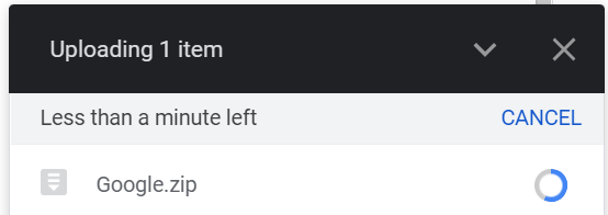
For instance, you can see the visibility of system status in the uploading screen of Google drive. While uploading any file in Google drive it shows how much time is left to upload the same. So, the user can patiently wait for the mentioned time. So if this visibility was not there, it would be frustrating for the user to wait for an uncertain amount of time and thus, the user will refrain from using the product.
Rule number 2: Match Between system and real world
We should use that type of language for the system which the user is familiar with, to establish proper communication.
For example, when we search in google maps about some place, we just input its name. But in a technical way, the system searches the location based on the latitude and longitude of the place which is visible on the URL. And, as a user, it’s very difficult to remember the latitude and longitude. Thereby google maps has made the communication between user and system easier by enabling users to input just the place name.

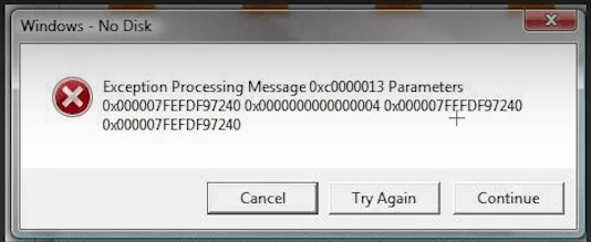
We should use less technical language and more user friendly language.
Like in the below example, the type of error should be mentioned in layman terms rather than showing random codes to the user.
Rule number 3: User Control & Freedom
This means giving freedom to the user to make decisions.
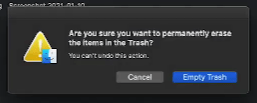
For example, in gmail, when we select some mails and delete, then we immediately get a pop-up message in down “to undo the action”.
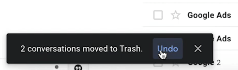
So, if by mistake a user deletes some messages, the same can be retrieved. Similarly, if we delete something from the system, it goes to the trash/recycle bin. And, when we want to empty the recycle bin, the system again asks a pop-up that “Are you sure you want to empty the recycle bin”?
So, we should give this kind of decision making power to the user throughout the flow.
Rule number 4: Consistency & Standards
If we are making any website etc, the components used should have a consistency. Like fonts, colours, buttons etc used for any website’s homepage should be carried forward to inner pages as well. They should follow a particular theme and maintain consistency throughout the flow.
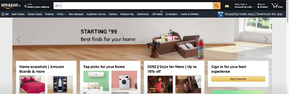
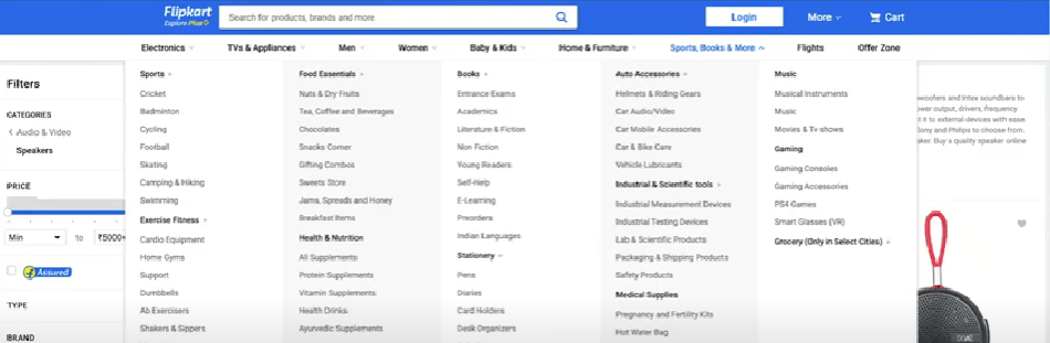
Some standards/behaviour of the user is global. Ex: In websites like amazon, flipkart etc, navigation is at right and logo is at left. These are called Global standards. Try to follow these standards as much as possible along with your creative freedom.
Rule number 5: Error Prevention
Providing information to the user if the user is making any mistake while entering/selecting etc. and also providing the suggestion then and there itself.
In case of lengthy forms to be filled by the user, we can have validations pop-up if the user makes any mistake or misses out anything.
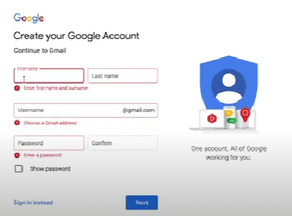
For example: When we are creating a new google account and if we don’t fill anything and just go to next, it will throw us an error and shows the required field in red colour and also gives suggestions like” enter first name and surname”; Choose a gmail address; Enter a password.
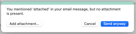
Also, in Microsoft Outlook, if we write the sentence: “pls find the attached” or word “ attached” in the mail and if we forgot to attach to anything, the system will throw an error: “Attachment is missing”.
By implementing these messages, users can timely reform the mistakes and also save time.
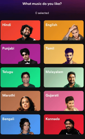
Rule number 6: Recognition rather than recall
Providing options to users to choose from rather than statements to write in a field. Framing the question in the right way. Like in real life, if we ask someone, what is the capital of India? Then the user might think and answer accordingly. But what if we frame the question in a way where options can be given for the user like – Is Delhi the capital of India. Options: yes or no?
For example, in Music streaming apps , when we first login, it asks us about the preferred genre and languages and there we get various options to choose from like rock/pop/jazz, english/hindi etc. But, if we ask the question like in which language , would you prefer to watch and give an input box below this then it will put more pressure on user memory & ease of use.
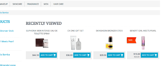
In online e-commerce websites, when we login, it shows us “recently viewed” items so that our mind doesn’t have to put much pressure on the memory to recollect our recently bought items or most bought items.

In online e-commerce websites, when we login, it shows us “recently viewed” items so that our mind doesn’t have to put much pressure on the memory to recollect our recently viewed items or most bought items, etc.
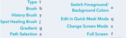
Rule number 7: Flexibility and Efficiency of use
Providing that much flexibility to the users such that users are able to perform the action quickly by themselves.
For example, in call centres and during data entry tasks, there will be lengthy forms and users have to enter data, the interface is designed keyboard friendly. Like if we press on TAB then it goes to the next field. And, we don’t use a mouse in that case to save on time.
Introducing short commands to users will also be very helpful. For example, in photoshop/illustrator, there are shortcut keys to perform specific actions to increase the efficiency.
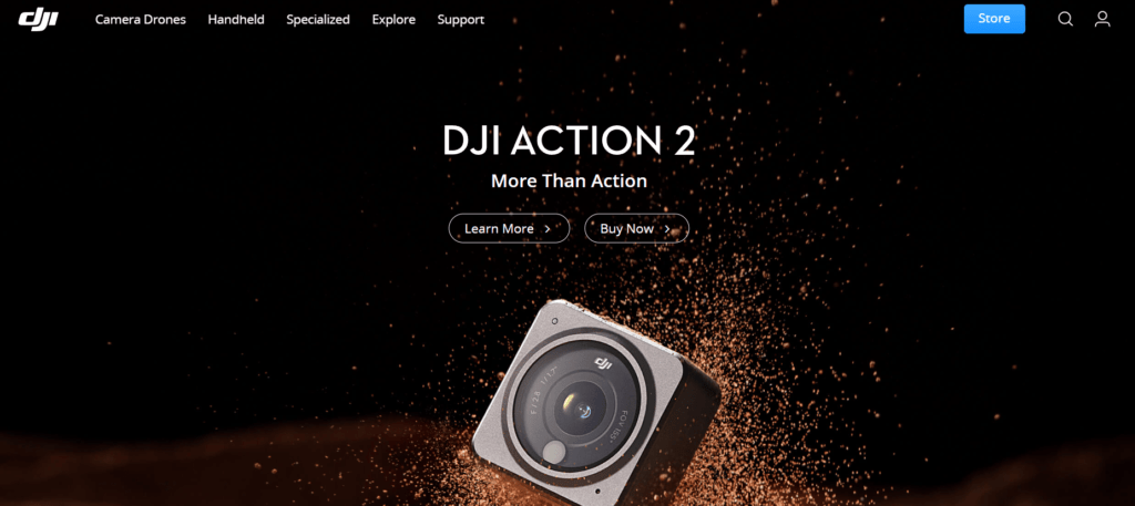
Rule number 8: Aesthetic and Minimalist Design
Don’t add any abstract things to the design or anything which distracts the user from concentrating onto the interface.
Don’t add unnecessary elements. Everything should have some use . Use only what is required.
Ex: DJI POCKET website. They have only played with logo, navigation and images and kept the website completely neat.
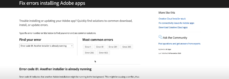
Rule number 9: Help users recognize, diagnose and recover from errors
If some error is thrown at the user, provide them with a solution as well.
For example, in adobe’s website, if we have any trouble in installing any adobe app, then it will give us a drop-down for “Find your error”. On selection of type of error , it will provide a description of that error along with the possible solutions. Also, it provides us with the list of most common error codes to save our time more.
Rule number 10: Help & Documentation
If we purchase any electronic device, then we get a user manual. And, sometimes, we read these manuals and sometimes we throw them out as we are aware of some of the properties of the system by ourselves.
Similarly, when we are making any enterprise level solutions, ERP softwares, etc. Since these systems are quite critical and exhaustive for the user to understand, we need to provide manuals for them detailing the workflow.
For example, in many software websites, there is a tab for “support” , “help”, where we find things related to that particular software.
If we have multiple pages, options and functions in any website, then Help & Documentation is mandatorily required.
Conclusion
We can use these 10 rules in preparing Heuristic reports of existing websites.
These 10 parameters help us to make Usability Heuristic reports of any existing or new website, app etc. and to build a better user experience.
To read more on these rules please visit Nielsen Norman Group page on 10 Usability Heuristics for User Interface Design : Link


Add Comment
You must be logged in to post a comment.
Vaibhav Bhosale
Great information!!